
Отличный дизайн помогает привлечь внимание к приложению. SSJetPackComposeProgressButton — это библиотека Android на GitHub для создания анимированных кнопок загрузки. В ее основе Jetpack Compose — современный декларативный UI-инструментарий на Android с готовым анимационным дизайном, скрашивающим ожидание пользователя при вызове API или выполнении какого-либо фонового процесса. Посмотрим, на что способна эта библиотека.
Jetpack Compose
Jetpack Compose упрощает и ускоряет разработку нативного пользовательского интерфейса на Android, позволяя быстро реализовать задумки по созданию приложения с меньшим кодом, мощными инструментами и интуитивно понятными API на Kotlin.
С чего начать?
Загружаем отсюда Android Studio Arctic Fox 2020.3.1 или новее и используем JDK 11.
Функционал
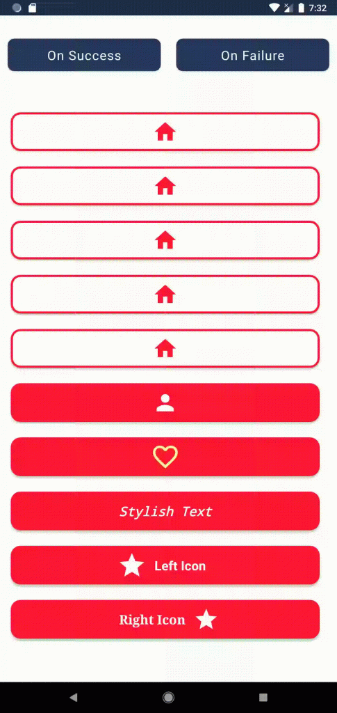
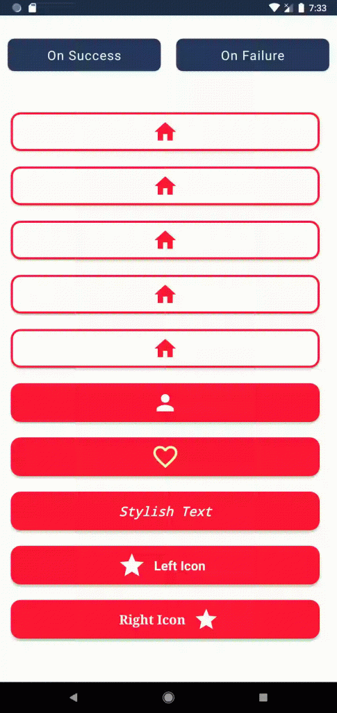
- Это современный инструментарий Android — поддерживает Jetpack Compose.
- Новое решение анимации загрузки — для более привлекательного приложения.
- Кнопка с появляющимся и исчезающим значком — для «горячих» функций.
- Кнопка с текстом, значком справа и слева.
- Разные состояния (бездействие, загрузка, успех, неудача) — для легкого управления кнопками.
- Полностью настраиваемая кнопка — радиус скругления угла, фон, цветовая палитра, скорость анимации и т. д.
- Настраиваемая анимация загрузки в виде логотипа и спецэффектов.

Установка
- Добавляем его в корневой
build.gradleв конце репозиториев:
allprojects {
	repositories {
		...
		maven { url 'https://jitpack.io' }
	}
}
2. Добавляем зависимость в файл build.gradle приложения:
dependencies {
         implementation 'com.github.SimformSolutionsPvtLtd:SSJetPackComposeProgressButton:1.0.6'
 }
Использование «SSJetPackComposeProgressButton»
- Там, где нужна кнопка:
var submitButtonState by remember { mutableStateOf(SSButtonState.IDLE) }
 SSJetPackComposeProgressButton(
     type = SSButtonType.CLOCK,
     width = 300.dp,
     height = 50.dp,
     onClick = {
         // Выполнит действие при нажатии кнопки и приведет ее в состояние ЗАГРУЗКИ
         submitButtonState = SSButtonState.LOADING
     },
     assetColor = Color.Red,
     buttonState = submitButtonState
 )
2. При успехе состояние submitButtonState меняется на success:
// При успехе изменит состояние submitButtonState на «success»
 submitButtonState = SSButtonState.SUCCESS
3. При неудаче — на «failure»:
// При неудаче изменит состояние submitButtonState на «failure»
 submitButtonState = SSButtonState.FAILIURE
Пользовательские настройки
Для кнопки, обозначающей загрузку, имеется уже готовый анимационный дизайн:
- круг;
- колесо;
- увеличивающийся/уменьшающийся круг;
- часы;
- спираль.
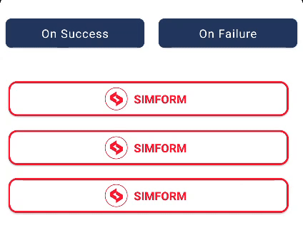
Его можно настроить под себя, использовав значок приложения или бренда, поменяв цвет или применив анимационные эффекты, например вращение, увеличение/уменьшение и т. д.
Вот пошаговый код для настройки кнопки загрузки:
var submitButtonState by remember { mutableStateOf(SSButtonState.IDLE) }
 SSJetPackComposeProgressButton(
     type = SSButtonType.CUSTOM,
     width = 300.dp,
     height = 50.dp,
     onClick = {
         // Выполнит действие при нажатии кнопки и приведет ее в состояние ЗАГРУЗКИ
         submitButtonState = SSButtonState.LOADING
     },
     assetColor = Color.Red,
     buttonState = submitButtonState,
     successIconPainter = painterResource(id = R.drawable.custom_success),
     failureIconPainter = painterResource(id = R.drawable.custom_fail),
     colors = ButtonDefaults.buttonColors(backgroundColor = Color.White),
     padding = PaddingValues(six.dp),
     text = stringResource(id = R.string.simform),
     textModifier = Modifier.padding(ten.dp),
     fontWeight = FontWeight.Bold,
     leftImagePainter = painterResource(id = R.drawable.simform_logo),
     buttonBorderStroke = BorderStroke(two.dp, colorResource(id = R.color.pink)),
     customLoadingIconPainter = painterResource(id = R.drawable.simform_logo),
     customLoadingEffect = SSCustomLoadingEffect(
         rotation = false,
         zoomInOut = true,
         colorChanger = false
     )
 )
Вот и все. Ваша персональная кнопка загрузки готова.

Есть много и других атрибутов для легкой настройки кнопки загрузки в Jetpack Compose. Вот их список:
Все атрибуты
++++
|        Attribute           |        Description            Default                               |
+----------------------------+--------------------------------------------+---------------------------------------+
|                            | Choose type of animation from:[CIRCLE,     |                                       |
| `type`                     | WHEEL, ZOOM_IN_OUT_CIRCLE, CLOCK, SPIRAL,  | false                                 |
|                            | CUSTOM]                                    |                                       |
|_________________________________________________________________________________________________________________|
| `width`                    | Width to be applied to the button.         | None                                  |
|_________________________________________________________________________________________________________________|
| `height`                   | Height to be applied to the button.        | None                                  |
|_________________________________________________________________________________________________________________|
| `onClick`                  | Will be called when the user clicks the    | None                                  |
|                            | button.                                    |                                       |
|_________________________________________________________________________________________________________________|
| `assetColor`               | Color to be applied to icon and text       | None                                  |
|                            | inside button.                             |                                       |
|_________________________________________________________________________________________________________________|
|                            | Represent the state of button from IDLE,   |                                       |
| `buttonState`              | LOADING, SUCCESS, FAILIURE from            | None                                  |
|                            | SSButtonState.                             |                                       |
|_________________________________________________________________________________________________________________|
| `buttonBorderStrok`        | Border to draw around the button.          | None                                  |
|_________________________________________________________________________________________________________________|
| `blinkingIcon`             | Icon will be blink with size and color.    | `false`                               |
|_________________________________________________________________________________________________________________|
| `cornerRadius`             | Corner radius to be applied to the button. | `20`                                  |
|_________________________________________________________________________________________________________________|
| `speedMillis`              | Speed of the animation while changing the  |                                       |
|                            | state.                                     | `1000`                                |
|_________________________________________________________________________________________________________________|
| `enabled`                  | Controls the enabled state of the button.  | `true`                                |
|_________________________________________________________________________________________________________________|
| `elevation`                | It is used to resolve the elevation for    |                                       |
|                            | this button in different.                  | `ButtonDefaults.elevation()`          |
|_________________________________________________________________________________________________________________|
|                            | Colors that will be used to resolve the    |                                       |
| `colors`                   | background and content color for this      |                                       |
|                            | button in different states                 | `ButtonDefaults.buttonColors()`       |
|_________________________________________________________________________________________________________________|
| `padding`                  | The spacing values to apply internally     |                                       |
|                            | between the container and the content.     | `PaddingValues(0.dp)`                 |
|_________________________________________________________________________________________________________________|
| `alphaValue`               | The alpha of the drawn area.               | `1f`                                  |
|_________________________________________________________________________________________________________________|
| `leftImagePainter`         | Painter to draw inside this left Icon.     | `null`                                |
|_________________________________________________________________________________________________________________|
| `rightImagePainter`        | Painter to draw inside this right Icon.    | `null`                                |
|_________________________________________________________________________________________________________________|
| `successIconPainter`       | Painter to draw inside this success state  | `rememberVectorPainter(image =        |
|                            | Icon.                                      |                  Icons.Default.Done)` |
|_________________________________________________________________________________________________________________|
| `failureIconPainter`       | Painter to draw inside this failiure state | `rememberVectorPainter(image =        |
|                            | Icon.                                      |                 Icons.Outlined.Info)` |
|_________________________________________________________________________________________________________________|
| `successIconColor`         | Color to be applied to success icon.       | assetColor                            |
|_________________________________________________________________________________________________________________|
| `failureIconColor`         | Color to be applied to failure icon.       | assetColor                            |
|_________________________________________________________________________________________________________________|
| `text`                     | The text to be displayed.                  | `null`                                |
|_________________________________________________________________________________________________________________|
| `textModifier`             | To apply to this text layout node.         | `Modifier`                            |
|_________________________________________________________________________________________________________________|
| `fontSize`                 | The size of glyphs to use when painting    |                                       |
|                            | the text.                                  | `TextUnit.Unspecified`                |
|_________________________________________________________________________________________________________________|
| `fontStyle`                | The typeface variant to use when drawing   |                                       |
|                            | the letters (e.g., italic).                | `null`                                |
|_________________________________________________________________________________________________________________|
| `fontFamily`               | The font family to be used when rendering  |                                       |
|                            | the text.                                  | `null`                                |
|_________________________________________________________________________________________________________________|
| `fontWeight`               | The typeface thickness to use when         |                                       |
|                            | painting the text (e.g., [FontWeight.Bold])| `null`                                |
|_________________________________________________________________________________________________________________|
| `hourHandColor`            | Color will be apply to hour hand in clock  |                                       |
|                            | type animation only.                       | `Color.Black`                         |
|_________________________________________________________________________________________________________________|
| `customLoadingIconPainter` | painter [Painter] to draw your custom      | `painterResource(id =                 |
|                            | loading icon.                              |            R.drawable.simform_logo)`  |
|_________________________________________________________________________________________________________________|
|                            | Custom loading animation type like         | `SSCustomLoadingEffect( rotation =    |
| `customLoadingEffect`      | roation, zoom in out etc.                  | false, zoomInOut = false,             |
|                            |                                            | colorChanger = false)`                |
|_________________________________________________________________________________________________________________|
| `customLoadingPadding`     | Spacing between button border and loading  | `0`                                   |
|                            | icon.                                      |                                       |
+----------------------------+--------------------------------------------+---------------------------------------+
Заключение
Благодаря библиотеке SSJetPackComposeProgressButton с современным Android-инструментарием Jetpack Compose нам доступно большое разнообразие вариантов анимации кнопки загрузки. Современный Android-инструментарий Jetpack Compose позволяет легко создать кнопку и интегрировать ее с фоновым процессом, например вызовом API. И изменять состояния в соответствии с тем, как вызов API проходит — завершается успехом или неудачей.
Вот полный рабочий пример в репозитории на GitHub.
Читайте также:
- Jetpack Compose: пользовательский интерфейс Twitter
- Поддержка новых форм-факторов с помощью новой библиотеки Jetpack WindowManager
- Jetpack DataStore: улучшенная система хранения данных
Читайте нас в Telegram, VK и Дзен
Перевод статьи Purvesh Dodiya: Progress Button using JetPack Compose: SSJetPackComposeProgressButton


